First, my thanks to all who left such lovely comments on my May letters. You're all SO encouraging
and it makes me smile.
I used an unlikely palette for 'U'. Background is not too bold but still almost takes over the letter.
V is a favorite color combo: blues and purples.
W is almost cartoon-like with it's bright yellow and red/pinky purple. Maybe the W stands for 'WAY out of character' LOL.
X is a contrast of ocean inspired pastels against bold red, yellow and black.
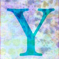
Y is back to the calm of blue, green and purple. This time with a bold letter on a subtle background.
Z is sliding off to the left, holding it's own against the chaotic maze of circles. Ah! So hard to believe the year is almost half over. Now it's on to the 'presentation'. Thank you for visiting!


These letters always make me think of the exercises given for colour-blindness... only better.
ReplyDelete