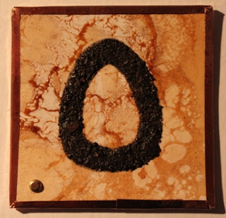
Hello A.L.A.W. friends, I hope you're all doing well. I've really enjoyed working on my letters and seeing what everyone has come up with; so many wonderful interpretations! Without further delay here are my letters for April: Lower case m for a modern approach-bright green for Spring, overlapping bold & subtle dots - out of register to add 'character' haha!
Next up; colorful chaos with a scratchy texture-N is more subtle, imbedded in the composition, unlike 'm' which is sitting on top.
O is larger-than-life and edging off the page, bold dots large and small for the background.
'p' is totally out of character, I have never used this color combo before, but it spoke to me so here it it. I feel like the letter is floating in a sea of dots, bobbing up and down. Very subtle large dot on left reminds me of a huge sun peeking over the horizon.
Thank you for visiting, have a great week.


