Monday, July 30, 2012

b and d

here is a B from a 12th century antiphonarium :

and the d is from the famous book of Kells (9th c.)

you can see that the parchment for the last one is a bit more tough and not so easy to paint on !

Home made colors : that means that the group of illuminators I'm working in prepare all the colors they use from plants, minerals, ... mixed with arabic gum and sugar and some other things, it depends of the rough material. then the product is put in little shelves to dry and we can use them just adding water with the brush (very tiny brush : 3/0 to 1 max, repique brushes). I have some plants in my garden I'm using for that.

for the D, I used malachite green, lapis lazuli blue, orpiment yellow and purple.

next ones soon ...

Saturday, July 28, 2012

Deb - second alphabet ABCD

 I usually only work with fabric but thought I'd have a play with paper for this alphabet. Way out of my comfort zone! I also wanted to use what I had and not buy any new materials, products, etc.
So I cut some water colour paper into squares and then found an old Ikea catalogue and had fun looking for pages with interesting patterns to cut letters from. I traced the letters and then used my embroidery scissors to cut them out! (I'm sure all you paper experts are having a fit! Don't look too closely at my rough cutting!) I then glued the letters to the background and drew a light wash of grey around the edge using a fabric marking pen. I had great fun doing these and it was nice to work with a different medium.  


Friday, July 27, 2012

Noela's Dotty alphabet

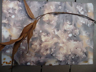
I have been preparing paper for this alphabet for several months - playing with 'bruising' papers, immersing in green tea in rusty oven trays, and using some sludgy inks and even mouldy green tea leaves.
The results from green tea and rust are the best.
These are some of the other results [showing the general process]- the dotty blobs are created from the rust as the fluid dried on the paper.
I have misplaced most of these papers in the chaos of the last few months, hmmmmm, but I found enough to start my dotty alphabet.
I wanted round, dotty letters and have made them as simple as possible. Not sure which ones to use - the positives, negatives, or relief overlay with both. I was thinking a concertina book, but may have to change my ideas to accommodate the relief [I really like the shadows]. Any ideas???

Lau's second alphabet

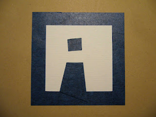
Here is the second alphabet. This time, I chose to work in a different way... First a blue square 7x7, then a white square (which is the letter), then I add pieces of blue paper "to draw" the letter. You can see the detail on the F photo.

Lau Dotty alphabet...


Almost finished, but not completely.
The cover is just missing.


Saturday, July 21, 2012

I have finished my first dotty alphabet.


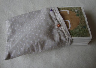
Here are my 26 letters as a dobble leporello, in a little bag, itself in a box (I  kept from a swatch !)

Friday, July 20, 2012

JGR - ABCD Second Alphabet

Hello, hello! I hope you're all are doing fine. Summer is hot here as always 90's (F) but in a few weeks we'll start really dreaming of Fall: crisp cool air and the beginning of Football Season, I can't wait!
And now for my second alphabet.
 This is NOT what I had in mind however, I was trying out some new shades of watercolors, letting them drip and merge to see how they mixed and voila'-I began to see the shape of an 'A' so, I added the thin cross bar and the suggestion of a serif (bottom right).
I tried another one . . . and this time, I helped it along nudging the paint, adding a light sweep of dry-brushing to get the fine lines. No preliminary sketching, or thinking for that matter LOL! just listening to my music, playing and enjoying those lovely surprises that are always lurking around the next bend.
"C" is my favorite so far, I like the smudge at the top right and the way it's barely recognizable as a letter. I tilted the paper to encourage 'color mingling' then, I left it flat for the paint to
'settle' which makes for random texture.
I had to blot "D"at the bottom right, it was beginning to creep to much and I like the mottled texture it left behind. So: I veered off course and here I am with a new direction for my second alphabet. I added the rounded border to add some control to this haphazard technique. Thank you for visiting!

Thursday, July 19, 2012

NEARLY THERE!

I am working on it, so hopefully done by the end of the month.
My next alphabet will be a bit late then as well, have to do 2 lots in august!

Jenny's July Jaunt

Couldn't resist the alliteration in the title!  Here are my first letters for the second alphabet - not sure if i have the dates right this time, the book-making confused me.  These were going to be much more complicated, with backgrounds etc, but i liked them too much to do anything else, so they got a coloured piece of paper and that's it!  They were drawn in lead pencil and then coloured in with watercolour pencils.  The  lead line was then rubbed out so the edge is nice and a bit wavy - hard to see in the photos.  The plan is to make them into a book at the end as well.


Alphabet Number 2

So here are the first 4 letters of my second alphabet
Which for me is the dotty one

These are tea bags

The letters are printed by cutting the shapes out of
Eucalyptus cinerea leaves

painting them with a little diluted egg yolk

and then clamping them with round metal lids
before boiling them for an hour or so
I had hoped the circle would print more prominently
but it did not so instead my dots have been
made by burning with an incense stick
x te

Tuesday, July 17, 2012

Medieval alphabet

As I told you in my presentation, I'm fond of historical letters, manuscripts and illuminated letters and pages.

So, here are my first two letters of my second alphabet, which are painted on pieces of parchment with home made colors. Each letter will be "inhabited" and are inspired by actual letters from manuscripts.


C is from a XIIe century manuscript and N from a late XVe.
I hope you will enjoy them, I'm having fun painting them !

Friday, July 13, 2012

Finished alphabet pages...

Hi all

I am loving the blog and the finished pieces - so much style and creativity (apologies for being late myself).  I have set up two pages at the top of the blog now that show the finished pieces.  I thought it would be good to have images of the finished pieces all in one spot so folk don't have to trawl thru the whole blog to see them...

Let me know if I have misinterpreted an alphabet's home (dotty or not) and if I have misattributed anyone - it's possible.

Hope you enjoy

Fiona


These letters (an experiment that went nowhere) have nothing to do with the post - I just like photos on blog posts!

UVWXYZ.... lau's letters

...finally, the last ones


Now I'm gonna think about how to make the final piece!

Wednesday, July 11, 2012


Finally put the spotty, dotty alphabet together....yes yet again another textile piece....pickmeup vest to cheer up a doldrum day.  Just what any young girl will want to accessorize with her jeans on her "Gone dotty day"!  Too late already gone!

Thursday, July 5, 2012

Alphabet for the Traveller

For my fifth set of letters - and the first for 2012 - I have cheated a tad by using information downloaded from Wikipedia.
I have made a timber box with 26 storage bays. I have then printed out each letter and glued them onto individual timber cards. The outline of the card is covered in hand-made paper and painted black. On the reverse side of the card are the semaphore flag symbols and morse code characters. Each card then fits into its own bay in the box, and a lid holds them in place...
For the letters I have used the Algerian Font. 
This handy box is a useful accompaniment for any intrepid traveller – both on land and at sea.


Box with lid

Rverse side with lid

Algerian is a decorative serif digital font family, a knock off of the Keystone Foundry's nineteenth-century face Glyphic. The design for the typeface is owned by Linotype, while the name 'Algerian' is a trademark of the International Typeface Corporation. This font was created in 1988.


Semaphore Flags is the system for conveying information at a distance by means of visual signals with hand-held flags, rods, disks, paddles, or occasionally bare or gloved hands. Information is encoded by the position of the flags; it is read when the flag is in a fixed position.
The modern flag semaphore system uses two short poles with square flags, which a signalman holds in different positions to signal letters of the alphabet and numbers. The signalman holds one pole in each hand, and extends each arm in one of eight possible directions. Except for in the rest position, the flags cannot overlap. The flags are coloured differently based on whether the signals are sent by sea or by land. At sea, the flags are coloured red and yellow (the Oscar flag), while on land, they are white and blue (the Papa flag). Flags are not required - they just make the characters more obvious.


Morse Code is a method of transmitting text information as a series of on-off tones, lights, or clicks that can be directly understood by a skilled listener or observer without special equipment.
Each character (letter or numeral) is represented by a unique sequence of dots and dashes. The duration of a dash is three times the duration of a dot. Each dot or dash is followed by a short silence, equal to the dot duration. The letters of a word are separated by a space equal to three dots (one dash), and two words are separated by a space equal to seven dots. The dot duration is the basic unit of time measurement in code transmission.


cheers - Ken Munsie - gotta dash - what was that dot ?